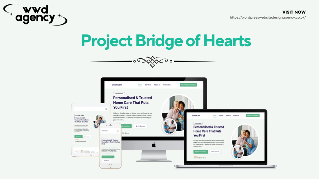
Emotional language combined with professional credentials proved families can feel reassured whilst seeing competence. The human approach became differentiator rather than credibility liability. Trust built through authentic warmth backed by evidence.
Launch in 1–2 Weeks
Free 24/7 Support for 1 Month
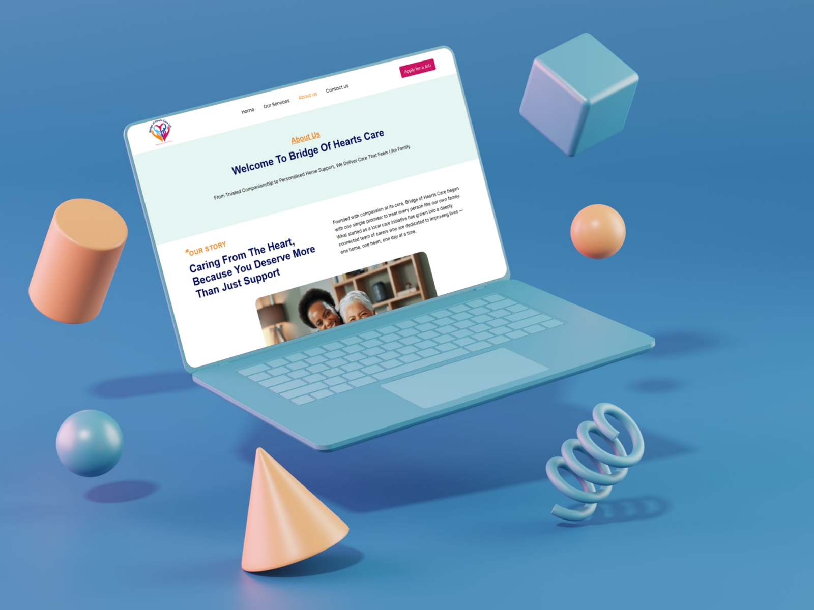
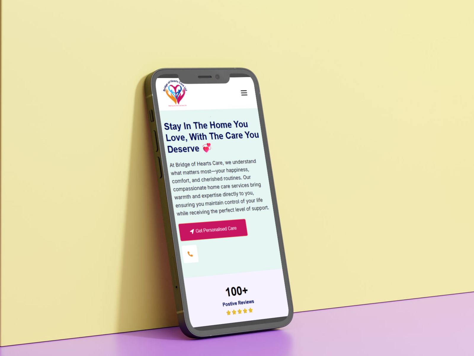
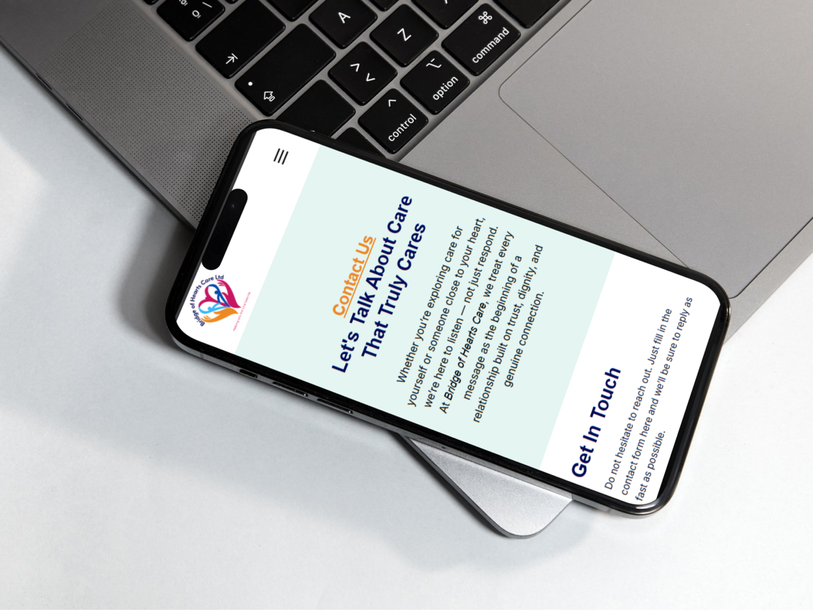
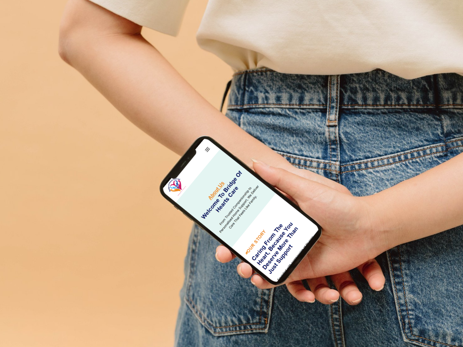
Custom & Modern Designs
Enterprise-Grade Security
100% SEO-Optimised
Built to Convert Leads
Launch in 1–2 Weeks
Free 24/7 Support for 1 Month
Custom & Modern Designs
Enterprise-Grade Security
100% SEO-Optimised
Built to Convert Leads